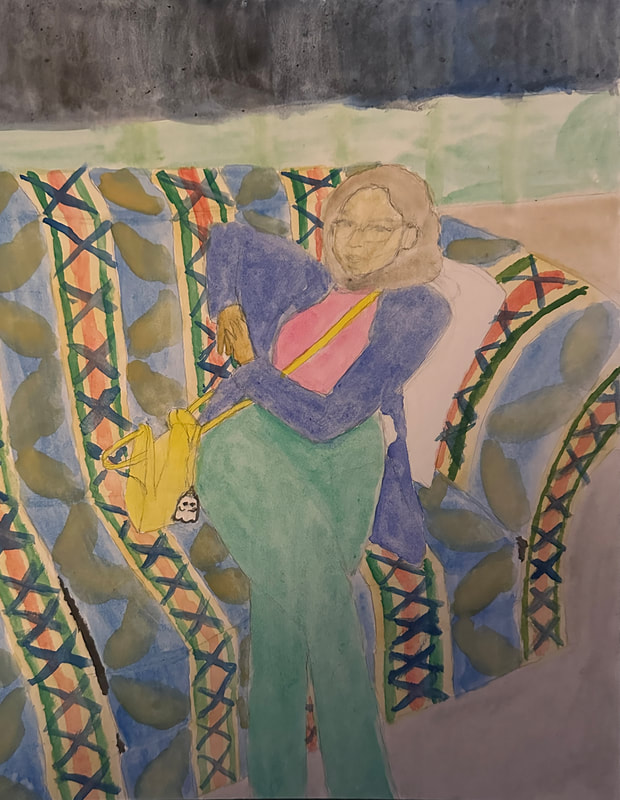
Watercolor Painting
|
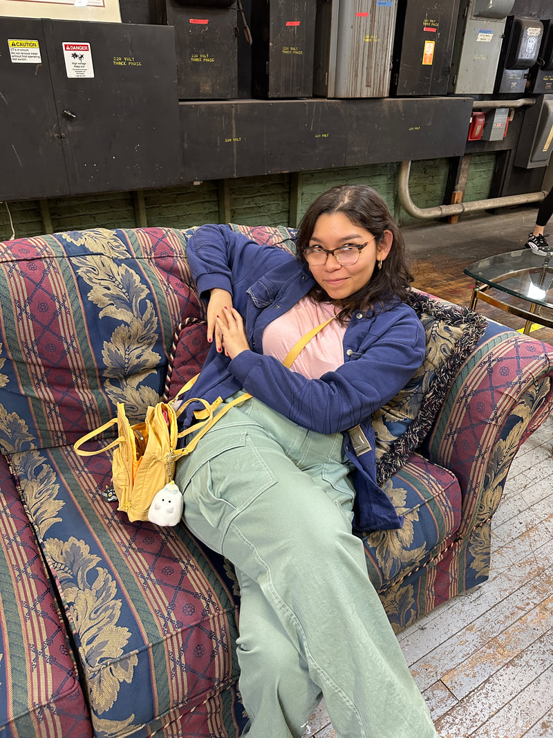
Title: Person Going Thrifting
Size: 43.18 cm x 33.02 cm Medium: Watercolor Completion Date: 12/16/2023 Exhibition Text:
This work is meant to capture the beauty of my partner to show how there is beauty in people. The use of vibrant colors in and around the person helps draw out their beauty. I am influenced by some of the composition and color aspects that are seen in André Derain's paintings. I am specifically mocking the composition of his Woman in a Chemise painting, placing the subject of a person in the middle, and coloring the background vibrant. |

|
Inspiration:
Artist in Focus: André Derain
The artist that I took inspiration from is André Derain. I specifically looked at two of his works called Woman in a Chemise and Charing Cross Bridge, London. When making these pieces, Derain is specifically trying to capture these moments and make them unique and beautiful by adding in vivid colors. In Woman in a Chemise, there is a woman posing for the painting sitting in the center of the image, being surrounded by bright colors. In Charing Cross Bridge, London, There is a view of the specific bridge with the colors again being exaggerated to be more bright and vivid. Despite all of the bright colors, there is still a sense of calm throughout the piece. There is not really a strong emotion being shown in the pieces. They are both just showing beauty in this natural way which leaves the viewer calm. I hope to be able to do this as well by not including strong emotions that are clearly visible. It will help me show beauty more as well. When I first saw both of these pieces, I just stared in awe, loving the simplisticness and colors. I want to be able to use these bright, vivid colors in my own piece to hopefully leave viewers in awe of my piece and just admiring the beauty in it. When looking at the pieces, they are both emphasizing different features. Woman in a Chemise is focusing on the foreground with the woman while Charing Cross Bridge, London is focusing on the background and midground of the piece. I am using these pieces as inspiration to help guide me to make a good foreground, midground, and background. In the pieces there are some differences with one using some bolder outlines of colors while the other uses solid colors connected with no line separating them. I plan to use something similar in my work, specifically outlining my person and then leaving the background more separate to help put more emphasis on the person.
The artist that I took inspiration from is André Derain. I specifically looked at two of his works called Woman in a Chemise and Charing Cross Bridge, London. When making these pieces, Derain is specifically trying to capture these moments and make them unique and beautiful by adding in vivid colors. In Woman in a Chemise, there is a woman posing for the painting sitting in the center of the image, being surrounded by bright colors. In Charing Cross Bridge, London, There is a view of the specific bridge with the colors again being exaggerated to be more bright and vivid. Despite all of the bright colors, there is still a sense of calm throughout the piece. There is not really a strong emotion being shown in the pieces. They are both just showing beauty in this natural way which leaves the viewer calm. I hope to be able to do this as well by not including strong emotions that are clearly visible. It will help me show beauty more as well. When I first saw both of these pieces, I just stared in awe, loving the simplisticness and colors. I want to be able to use these bright, vivid colors in my own piece to hopefully leave viewers in awe of my piece and just admiring the beauty in it. When looking at the pieces, they are both emphasizing different features. Woman in a Chemise is focusing on the foreground with the woman while Charing Cross Bridge, London is focusing on the background and midground of the piece. I am using these pieces as inspiration to help guide me to make a good foreground, midground, and background. In the pieces there are some differences with one using some bolder outlines of colors while the other uses solid colors connected with no line separating them. I plan to use something similar in my work, specifically outlining my person and then leaving the background more separate to help put more emphasis on the person.

|

|
Planning:
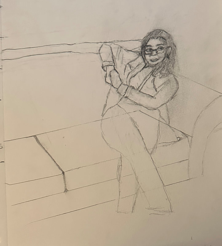
When planning this piece, I wanted to mess around with compositions. I had taken a lot of pictures for the painting to be based off of so the first step will have to be narrowing it down based off of what composition I like the most. I drew each of the three compositions, and then built off of the one that I liked the most that I would then use for my final product.

|
|

|

|
|

|
I will be using Derains use of vibrant colors in this piece in order to draw out the beauty of the scene. I will also be using the technique he uses where the subject has more loose lines while the background has stricter lines. In his colors, he has patches where the colors are darker than normal which is another aspect I will mock as well to help add more color to show the pieces beauty.
Process:
The first step I took was sketching out my image onto my board. After getting a simple sketch down, I started to clean it up and give it firmer lines. Once it was all on the board, it didn’t look correct so I redrew some bits of it, specifically the face. Then, I moved onto coloring the clothing of the person. After getting a couple of layers of the clothing colors on the board, I then moved onto the couch.

|

|

|
Working on the couch was a bit difficult overall. There was a very unique pattern on it that seemed a bit hard to paint at first using watercolors. I was able to break it down into steps and get through it all however. I first started with the base colors of the couch being yellow and blue. I separated the couch into sections and started painting the two colors. After finishing all of the base lines, I started to add the other colors. To simplify it and also allow me to incorporate the main colors, I did three main lines of green red and green, excluding the thin red lines as it would get too clustered. While waiting for that to dry, I moved back over to the blue to create the leaf design. I also kept this simple and just made the leaf shape as a yellow blob on the blue. After getting that down, I moved back over to the yellow part, adding in blue crosses every now and then that also appear on the actual couch design. I got through it all on the main body of the couch and then finished it up on the arm and top, finally finishing the couch.

|

|

|
Next, I went back to the person and tried to get the skin color on the face and hands. While letting that dry, I moved onto the background and floor. The floor was pretty simple as I just left it gray and brown in the different parts, creating movement in the color with darker sections within it. Then I moved onto the higher background, just painting it all a blue. I went back over it with black and blue a couple more times and it was finished. I finally went back to the face to make the skin darker and also outline the glasses, eyes, and lips, finishing off the piece.
|

|
Experimentation:
In this piece, I experimented with a couple of different things. The main thing was the drawing of the person. I have not really practiced drawing people that often, so I knew that I would have some trouble drawing the person. I was able to get the body and shape down okay, but the main struggle was the face. In my opinion, I wasn't really able to capture the face correctly to live up to my standards. Something always looked wrong. I tried drawing it a couple times to no avail. I ended up asking a friend for some tips about how to capture the face which helped out a bit. When I started sketching on the actual board, it was still proving to be difficult, but I eventually got a look that was okay.

|

|

|
I also did some minor experimentation with the background of this piece, specifically the top of it, where there are these boxes. When looking at the original image, I saw that they were different shades of black. However, I knew that if I made those colors black, it would take away the attention from the person, by being too dark. The black colors also took away from the vibrancy that is in the rest of the piece. I combated this by making it slightly blue. The blue coloring would help make it brighter overall and give it some more color. I started this process by going over the area with a blue color, and then going back over to draw some lines to separate the different boxes. When looking at it, something seemed off about it. the blue looked a little too bright, so I decided to put a black layer over it to darken it. When I did this, the black went on a lot darker than I expected. This made it all look too dark now. So, I did what I could to make it more vibrant, by adding in one last additional blue layer on top.

|

|
Critique:

|
There are some similarities in my piece and my inspiration. For example, the overall composition of both pieces are similar with there being the main focal point of a person. Another similarity is seen in the colors of the piece with how they tend to be more vibrant and not dull. The subject of both of the pieces is also a person as well. The lines in both pieces are also similar with how there are some that are more defined and straight and others that are loose. You can see some of the looser lines in the background and the straighter lines in the background. Another similarity is seen in the meaning behind the pieces of capturing a moment to draw out its beauty.
There are also some differences in my piece and my inspiration. While the scaling and balance of everything is similar, you can see in my inspiration that it is slightly bigger scaling. Because of this, its balance is a bit different as well. This also creates more emphasis on my background which helps bring out more beauty in my piece. The arrangement is also slightly different with the direction in which my subject is facing. This also affects some of the direction in my piece to curve the other way. A final difference is seen in the material, as I am using watercolors in my piece.
There are also some differences in my piece and my inspiration. While the scaling and balance of everything is similar, you can see in my inspiration that it is slightly bigger scaling. Because of this, its balance is a bit different as well. This also creates more emphasis on my background which helps bring out more beauty in my piece. The arrangement is also slightly different with the direction in which my subject is facing. This also affects some of the direction in my piece to curve the other way. A final difference is seen in the material, as I am using watercolors in my piece.
Reflection:
This piece helped me further my watercolor skills and techniques. It helped me work a lot with the layering of colors. It also helped my normal drawing techniques by exposing me to drawing a human person in scale which I usually don't do. My inspiration was André Derain and his painting style. While it is a different medium, you can still see how they connect with the style in which I made my piece overall. My biggest challenge was definitely drawing the actual human person with these proportions on this scale since I do not practice drawing humans and proportions often. This project ties into previously learned exercises and concepts by using similar techniques to other paintings André Derain made, and with the concept of beauty that is seen in my other pieces. My favorite part of this piece is the couch and the way the colors work together. It is pleasing to the eyes and looks nice and colorful. My least favorite part is probably the way the person turned out. I don't think I was able to capture the person correctly enough to leave me satisfied. I hope others view my work and see the beauty in the piece, and the person.
Connecting to the ACT:
Clearly explain how you are able to identify the cause effect relationship between your inspiration and its effect on your artwork?
There is a cause effect relationship in my inspiration and my work through the composition and style as well as the vibrant colors.
What is the overall approach the author has regarding the topic of your inspiration?
Derain is trying to show the beauty of these different environments through his use of vibrant colors as well as techniques of brush strokes.
What kind of generalizations and conclusions have you discovered about people, ideas, culture, etc. while you researched your inspiration?
I have made the conclusion that beauty is everywhere and can be shown in many ways.
What is the central idea or theme around your inspirational research?
The central idea or theme around my inspirational research is the perception of beauty.
What kind of inferences did you make while reading your research?
I made some inferences about the process of everything and how he got the piece made.
Citations (MLA):
“Woman in a Chemise - André Derain - Google Arts & Culture.” Google, Google, artsandculture.google.com/asset/woman-in-a-chemise-andr%C3%A9-derain/hQFYFYqBAXTSug. Accessed 11 Oct. 2023.
